http://www.digitalpanorama.co.uk/
An exhibition of panorama photographs by a photographer Henry Reichhold. The photographs were taken by a Nokia mobile phone and digitally stitched. Henry also teaches photography at "Digital Photography and Photoshop" short course at Central Saint Martins and I took the course in 2007. At that time, there was also an exhibition of panorama photographs taken by a Nokia mobile phone at Royal Albert Hall.
Henry Reichhold
http://www.reichholdarts.com/
Digital Photography and Photoshop (Short course at Central Saint Martins)
http://courses.csm.arts.ac.uk/shortcourse.asp?CI=6824&CT=1&MA=5&CAT=43&CSM=yes
Wednesday, 2 December 2009
Sunday, 18 October 2009
Project 23: implied lines
Take 2 photographs that use the folloiwng kinds of implied lines to lead the eye:
- an eye-line
- the extension of a line, or lines that point.
***

This photograph is an example of an implied line by an eye-line. The eye-line of the man in the advertisement picture leads to an woman walking on the street as illustrated by the red line below.


This photograph is an example of an extension of a line. The arrow on the street leads the viewer's eye to the direction of the two women running on the street as illustrated by the red line below.

Sunday, 4 October 2009
High speed sync explanation video by PocketWizard
This video is an advertisement by PocketWizard but the first half of the video is actually a very good explanation about how flash high speed sync works.
Project 22: curves
Take 4 photographs which have curve lines.
***

A circle gate sign of a building

A curved pavement stones

A curved fence

A curved street
***

A circle gate sign of a building

A curved pavement stones

A curved fence

A curved street
Sunday, 27 September 2009
Project 21: Diagonals
Take 4 photographs, which use diagonals strongly.
***

A shop's tent.

Railroad tracks (diagonals by perspective).

Decoration of brick wall.

A tree branch.
***

A shop's tent.

Railroad tracks (diagonals by perspective).

Decoration of brick wall.

A tree branch.
Project 20: Horizontal and vertical lines
Produce 4 examples of vertical and 4 of horizontal. In each photograph, try to subordinate the content of the picture to the line.
***

The fence outside the British Museum. Vertical lines appear as the bars of the fence and also decorations on each bar.

The front part of a taxi..

A plastic highlight signal bar in the middle of a street.

White thin blinds on a shop window.

A joint part of a London bus.

Closed shop shutter.

A column of a building which has horizontal line decoration.

Stairs at a tube station.
Wednesday, 16 September 2009
Monday, 14 September 2009
Project 18: relationship between points
Find at least 2 normally occurring situations in which there are 2 points, and take the photographs of them quite naturally.
***

This is an example of two points; two arrows on a shop window. Since two points are almost same in size and they are placed almost in the same distance from the centre, both attract attention equally. However, in this particular photograph, the reflection of the green traffic light is very strong, so it might be the first thing to attract the viewer's attention, which was not my attention when taking this photograph.

Two flags on a roof of a pub can be seen as two points. Both of the points are almost same in size and placed almost equally from the centre, so both should attract attention equally, which makes the image static.

The red traffic signs are two points in this photograph. The right one is close to the viewer and bigger in the photograph, whereas the left one is far from the viewer and is seen smaller. Since the right one is bigger, it attracts the viewer's attention first, then the viewer's eyes are drawn to the left one, which is smaller but brighter.
Tuesday, 28 July 2009
Project 17: Positioning a point
Take 3 photographs in which there is a single point, placed in a different part of the frame, and justify the reason for the position of the point.
***

The yellow padlock is regarded as a point in this photograph. It is placed at the crossing point of the one-third line from the right and one-third line from the top.

The soap bubble is the point in this picture. It is placed at the crossing point of the one-third line from the right and one-third line from the bottom.

A bird's feather is the point in this picture. It is placed around at the crossing point of the one-third line from the left and one-third line from the bottom.
I think these photographs show that the traditional "rule of thirds" works well when positioning a point.
Coincidentally all of the three photographs above have a vertical line near the point. I think the line adds extra stability to the composition because I can feel the point is attached to the line. If there were nothing in the background, I would feel the point is somewhat adrift and might feel something is missing.
Monday, 27 July 2009
Photography is ‘Not A Crime’
http://www.not-a-crime.com/
"Police routinely invoke anti-terror legislation to prevent photographers from carrying out their work, and photojournalists are constantly filmed at public gatherings and their details kept on an ever-growing database. Tourists, particularly foreign tourists, are also targeted by police, as was the case with an Austrian father and son recently who made the mistake of photographing a building of an extremely sensitive nature—Walthamstow bus station.
Put simply, Britain has become a no-photo zone, and so if you fail to comply, you may find yourself liable to attack, arrest or harassment. Recognising that Britain is not the only country where such a draconian anti-photographer culture is developing, the British Journal of Photography is beginning an international visual campaign to raise awareness."
Sunday, 26 July 2009
Assignment1: questions and answers
Questions asked when submitting the assignment 1 and the tutor's answers to them.
Question 1.
In this assignment, I mainly focused on the contrasts of graphical elements. In other words, I could only take photographs of tangible things and hence my photographs here only one layer of the meaning. However, some of the themes in this assignment are abstract (such as strong/week, sweet/sour). I would like to become competent to be able to capture such abstraction in my photographs and make them have multiple layers of the meaning. How can I develop this skill?
[Tutor's answer]
With regard to your images having multiple layers of meaning and how to develop this skill. I would first suggest that you find examples of images that do this. Write some brief notes on these images on how the different layers of meaning are present in the images. Remember that the meaning of photographs can be shifted in so many ways - the use of a caption alone can change the meaning. The next stage will be to practice and keep practising with your own work. At first you may find that your images are contrived or awkward but keep trying - it is only with practice that you will develop your own photographic style.
Question 2.
I always take photographs alone and I often feel it difficult to keep an objective opinion on the quality of my own photographs. I think one of the reasons is because I do not have a framework for the judgement. How do the professional photographers develop their own frameworks to judge their own work?
[Tutor's answer]
Your second question is about gaining judgement of your work. Firstly consider if you can get some second opinions on your work - doing this course is one way. You could join a local camera club and if you haven't done so there is Flickr - there is a thriving OCA group on there who are very supportive and offer constructive criticism. The link is:
http://www.flickr.com/groups/ocarts/
One of the best ways to strengthen your own judgements skills is to review other photographer's work - consider why some images work and others don't. By using Flickr or joining photography club you can not only have your work reviewed but can participate in the process.
I hope this helps answer your questions - the key to become an accomplished photographer involves three main strands: keep taking your own images; review your own work; review other photographer's work. The three elements combined will strengthen your own practical skills.
Thursday, 23 July 2009
Thousand Portraits
http://thousandportraits.com/
by Eamon Lane and Carlo Nicora
http://www.1000portraitsbcn.com/en.html
by Gerard Franquesa Capdevila and Sergi López Graells
"Our project is a true portrait of Britain created by photographing 1,000 people.
We stopped everyone who crossed our path on the streets of London, excluding nobody, asking the same question more than fifteen hundred times.
In a moment where recession is the main subject of every discussion, it was striking to come across such positive attitude.
This is the true face of Britain."
by Eamon Lane and Carlo Nicora
http://www.1000portraitsbcn.com/en.html
"If we think about the great cities that make up the social imaginary, their emblematic buildings, monuments and places will quickly come to our minds … But this is only the inert part of the cities, great cities are made by the people living there, inhabiting its public spaces.
Through this experience we want to express one of the many possible representations of the city of Barcelona, with its inhabitants as the main characters this time.
For a weekend we walked through the streets of the city, explaining the project and asking people to collaborate in it, until we completed 1000 portraits.
The project is original to the city of London by the photographers: Eamon Lane and Carlo Nicora. We wanted to continue the project transferring it to Barcelona with the intention that by extending it to other cities, it becomes a global project, capable of explaining the large capitals through the portraits of the people that live in them.
..."
by Gerard Franquesa Capdevila and Sergi López Graells
Wednesday, 22 July 2009
Is the Robert Capa's photo fake?

http://www.bbc.co.uk/blogs/photoblog/2009/07/the_whole_story.html
"So it's a fake. Or at least that's the claim by Spanish newspaper El Periodico and followed up in The Independent amongst others.
Robert Capa's picture (above) is known as the falling soldier and is allegedly of a man's last moments during the Spanish Civil War in September 1936. It's a picture that has confounded critics and historians for many years.
..."
Monday, 13 July 2009
International Garden Photographer of the Year 2009 Exhibition
http://www.igpoty.com/Exhibition.asp
The second annual International Garden Photographer of the Year exhibition is now the Royal Botanic Gardens, Kew, from May 22nd to September 13th, 2009.
The second annual International Garden Photographer of the Year exhibition is now the Royal Botanic Gardens, Kew, from May 22nd to September 13th, 2009.
Thursday, 9 July 2009
Tuesday, 7 July 2009
Saturday, 4 July 2009
Hasselblad CFV-39
http://www.photographyblog.com/news/hasselblad_cfv-39/
Hasselblad have introduced the Hasselblad CFV-39, a 39-megapixel digital back for their classic V system cameras.
Hasselblad have introduced the Hasselblad CFV-39, a 39-megapixel digital back for their classic V system cameras.
Tuesday, 30 June 2009
Sunday, 28 June 2009
Project 16: defining a point
Write down situations which would make a clear photograph of a point and find photographs that contain obvious points.
***
Small objects in a plane background. For example, a flower in a green (sometimes out of focus) background.


Small people or animal in a landscape. Some of the travel photographs intentionally include a small person or animal to attract viewers' attention and to make the photographs more interesting.
 Copyright: Steve Watkins http://www.vividplanet.com/
 Copyright: Anthony Webb http://www.anthonywebb.com/
One of the famous photographs that the point actually becomes the main subject of the photograph, which I think is quite rare.
 Copyright: Stuart Franklin http://www.stuartfranklin.com/
Saturday, 27 June 2009
Assignment 1: the theory and practice of contrasts
(26/07/2009) Added tutor's comments.
1. Pointed/blunt
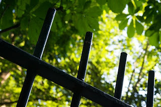
I found these fences in a park and thought the tip of the fences were a good example of the contrast of pointed and blunt. Therefore, this is very straight, just contrast of the shapes and no abstract meaning behind the photographs. It was a challenge to take these photographs because of the bright background (sky/tree) and the dark subject (fence). The fences are shown as almost silhouettes in the photographs, which actually emphasis the contrast of the shapes.
Pointed
 Shutter speed: 1/60 sec, Aperture: f/8, Focal length: 60mm, ISO 800
Blunt
 Shutter speed: 1/60 sec, Aperture: f/10, Focal length: 60mm, ISO 800
[Tutor's comment]
In these two images you have made a good visual contrast. The framing of both fences by using the diagonal line has added some graphical elements to the image. The black railing conrast well against the trees and sky of the background. The exposure has been controlled well to avoid over-exposure. On pointed I feel that the brick wall would be better not in the image. Although the use of a small depth of field has helped to blur it out of focus
2. Diagonal/rounded
I found these benches in the same park and the line of the bench seats could make a contrast of the diagonal and rounded. I could have been closer to the subject and take more abstract photographs by just showing the lines but I think it is more important to make it clear that both of the subjects are benches by showing the other part of the benches, which gives the two photographs a stronger connection and make the comparison more interesting.
Diagonal
 Shutter speed: 1/200 sec, Aperture: f/2.8, Focal length: 60mm, ISO 800
Rounded
 Shutter speed: 1/250 sec, Aperture: f/2.8, Focal length: 60mm, ISO 800
[Tutor's comment]
Again you have made a very good visual contrast with the two benches. You have photographed each bench by including enough information for the view to understand the photograph. However, by adopting an abstract approach you have then created visual interest to the image. On diagonal I feel you could have cropped a bit closer to fill more of the frame with the slats of the bench. In rounded I particularly like the soft lighting and how the curve of the seat has been shown.
3. Many/few
Two close-up photographs of flowers. The number of flowers makes the contrast of many and few. To make the contrast obvious, similar colours of the flowers (purple) and background (green) were chosen, and shallow depth of field was used so that the subjects were isolated in a blurred background.
Many
 Shutter speed: 1/200 sec, Aperture: f/3.2, Focal length: 60mm, ISO 800
Few
 Shutter speed: 1/100 sec, Aperture: f/3.5, Focal length: 60mm, ISO 800
[Tutor's comment]
This is a great pair of images. The images contrast well together. In particular you have kept the same depth of field and colours, which further unites the images. I feel that few is a wonderful image. The focus has been well controlled for the repetition of the flower heads to recede in the frame.
4. Straight/curved
These are pavement in a park and show another example of the contrast of the graphical elements. In order to make the contrast obvious, the composition was carefully considered so that there were no other elements in the frame. The subjects were slightly off-centred, which makes the very simple photographs slightly dynamic.
Straight
 Shutter speed: 1/100 sec, Aperture: f/7.1, Focal length: 60mm, ISO 800
Curved
 Shutter speed: 1/100 sec, Aperture: f/5.6, Focal length: 60mm, ISO 800
[Tutor's comment]
A set of deceptively simple images. However I can appreciate the care and attention to the composition. The sections have been carefully chosen to eliminate the background detail. The grey path is set off by the green grass. Well done on such a considered pair of images.
5. Long/short
These are still life photographs of two different kinds of peppers and show an example of the contrast of long and short. In terms of the composition, the subjects were placed horizontally in the centre and vertically about 1/3 from the bottom of the frame, which makes the photographs very static. Also the colour makes a contrast (background (white) and subject (red pepper and green stalk)) in each photograph.
Long
 Shutter speed: 1/30 sec, Aperture: f/11, Focal length: 60mm, ISO 200, tripod, portable flash
Short
 Shutter speed: 1/60 sec, Aperture: f/11, Focal length: 60mm, ISO 200, tripod, portable flash
[Tutor's comment]
Another simple but effective set of images. The size of the peppers does contrast the two words well. The composition is effective and the wine glass does add some scale into the image. The use of the flash has caused some bright highlights on the skin of the peppers - diffusing the light or using a reflector could avoid these. Assignment 4 will get you to look at different lighting sources so this is an area covered in the course.
The white backdrop has kept the image crisp and allows the read to dominate the frame.
6. Large/small
These are another pair of photographs of vegetables and show an example of the contrast of large and small. Again the subjects were placed in the centre, which makes the photographs look very static. The white balance was altered in the post-production phase so that the photographs convey warm feeling in accordance with the colour of the onions.
Large
 Shutter speed: 1/60 sec, Aperture: f/11, Focal length: 60mm, ISO 200, tripod, portable flash
Small
 Shutter speed: 1/60 sec, Aperture: f/11, Focal length: 60mm, ISO 200, tripod, portable flash
[Tutor's comment]
In these images I feel that the difference in size is not as clearly shown as in the above images as the framing is different between the two images. The composition is effective with the use of the newsprint. I feel that the white balance is slightly too warm - although I know you wished to emphasise the warmth of the onions. The depth of field in both images is quite small, as not all the onions appear to be in focus. I feel that a larger depth of field would be better to ensure all the onions are in focus.
7. Liquid/solid
These are two photographs of a wine glass, in which white sparkling wine is being poured in one photograph and golden beads are being put in the other. They show the contrast of liquid and solid. The bubbles that the sparkling wine generates look like beads but they can only exist by contained in the liquid, whereas the actual beads are solid existence and can exist forever.
Liquid
 Shutter speed: 1/60 sec, Aperture: f/22, Focal length: 60mm, ISO 200, tripod, portable flash
Solid
 Shutter speed: 1/60 sec, Aperture: f/22, Focal length: 60mm, ISO 200, tripod, portable flash
[Tutor's comment]
A wonderful pairing of images - and one of the best examples I have seen for this set of words. Well done on such an accomplished pair of images. The black background allows the glass and the colour of the beads and wine to be seen. The lighting is well controlled to prevent any highlights on the glass. The composition is excellent with the crop on just the main part of the glass.
8. Still/moving
These are two photographs of Christmas decoration balls, which show the contrast of still and moving. The photograph to show stillness was just taken when the balls were not moving and the other photograph was taken when one of the balls was moving using a slow shutter speed and multiple flash firing. I intentionally made one ball to stay still because it is necessary to have something same in both photographs in order to emphasis the difference (the movement in this case).
Still
 Shutter speed: 1.6 sec, Aperture: f/22, Focal length: 60mm, ISO 200, tripod, portable flash
Moving
 Shutter speed: 1.6 sec, Aperture: f/22, Focal length: 60mm, ISO 200, tripod, portable flash
[Tutor's comment]
In this pair you have shown good exposure control to blur the movement. In addition you have shown a multiple flash technique, which can be quite difficult to master. The background has been well chosen as it fits the soft colours of the decorations. In terms of composition I feel that the images lack something but do show excellent technical control.
9. Smooth/rough
This is a photograph to show the contrast of smooth and rough in one photograph. I found this tree in a park and I do not know the reason why the bark was clearly divided into two areas, I thought it was a very good example of the contrast. It is not something the photographer has created in any way, but discovering a contrast in the real world would probably be one of the important skills for photographers.
Smooth and rough
 Shutter speed: 1/60 sec, Aperture: f/4, Focal length: 60mm, ISO 800
[Tutor's comment]
In this image you have recognised a good scene for the image. You have adopted a very straight on approach to the truck, which I think suits the image well. The exposure is well controlled. You could possibly use a smaller depth of field (if possible on your lens) to further blur the background.
[Tutor's comment]
Summary
An excellent start to the course. You have understood the essence of the assignment and produced images, which visually contrast the words. In addition each set of images work as a pair. You have shown an ability to recognise both found scenes in the environment - e.g. straight/curved; pointed/blunt and to create your own still-life arrangements e.g. liquid/solid; long/short.
I feel that you have strong visual skills combined with good technical skills and that the course will further enhance both these elements. In addition you will find that the process of reviewing your work will allow you to be more self-critical of your images.
In some of your images you have used portable flash - if you haven't already come across Strobist - I highly recommend it for a source of tips on how to use your flashgun creatively. You can check out:
http://strobist.blogspot.com/
http://www.flickr.com/groups/strobist/
1. Pointed/blunt
I found these fences in a park and thought the tip of the fences were a good example of the contrast of pointed and blunt. Therefore, this is very straight, just contrast of the shapes and no abstract meaning behind the photographs. It was a challenge to take these photographs because of the bright background (sky/tree) and the dark subject (fence). The fences are shown as almost silhouettes in the photographs, which actually emphasis the contrast of the shapes.
Pointed
 Shutter speed: 1/60 sec, Aperture: f/8, Focal length: 60mm, ISO 800
Blunt
 Shutter speed: 1/60 sec, Aperture: f/10, Focal length: 60mm, ISO 800
[Tutor's comment]
In these two images you have made a good visual contrast. The framing of both fences by using the diagonal line has added some graphical elements to the image. The black railing conrast well against the trees and sky of the background. The exposure has been controlled well to avoid over-exposure. On pointed I feel that the brick wall would be better not in the image. Although the use of a small depth of field has helped to blur it out of focus
2. Diagonal/rounded
I found these benches in the same park and the line of the bench seats could make a contrast of the diagonal and rounded. I could have been closer to the subject and take more abstract photographs by just showing the lines but I think it is more important to make it clear that both of the subjects are benches by showing the other part of the benches, which gives the two photographs a stronger connection and make the comparison more interesting.
Diagonal
 Shutter speed: 1/200 sec, Aperture: f/2.8, Focal length: 60mm, ISO 800
Rounded
 Shutter speed: 1/250 sec, Aperture: f/2.8, Focal length: 60mm, ISO 800
[Tutor's comment]
Again you have made a very good visual contrast with the two benches. You have photographed each bench by including enough information for the view to understand the photograph. However, by adopting an abstract approach you have then created visual interest to the image. On diagonal I feel you could have cropped a bit closer to fill more of the frame with the slats of the bench. In rounded I particularly like the soft lighting and how the curve of the seat has been shown.
3. Many/few
Two close-up photographs of flowers. The number of flowers makes the contrast of many and few. To make the contrast obvious, similar colours of the flowers (purple) and background (green) were chosen, and shallow depth of field was used so that the subjects were isolated in a blurred background.
Many
 Shutter speed: 1/200 sec, Aperture: f/3.2, Focal length: 60mm, ISO 800
Few
 Shutter speed: 1/100 sec, Aperture: f/3.5, Focal length: 60mm, ISO 800
[Tutor's comment]
This is a great pair of images. The images contrast well together. In particular you have kept the same depth of field and colours, which further unites the images. I feel that few is a wonderful image. The focus has been well controlled for the repetition of the flower heads to recede in the frame.
4. Straight/curved
These are pavement in a park and show another example of the contrast of the graphical elements. In order to make the contrast obvious, the composition was carefully considered so that there were no other elements in the frame. The subjects were slightly off-centred, which makes the very simple photographs slightly dynamic.
Straight
 Shutter speed: 1/100 sec, Aperture: f/7.1, Focal length: 60mm, ISO 800
Curved
 Shutter speed: 1/100 sec, Aperture: f/5.6, Focal length: 60mm, ISO 800
[Tutor's comment]
A set of deceptively simple images. However I can appreciate the care and attention to the composition. The sections have been carefully chosen to eliminate the background detail. The grey path is set off by the green grass. Well done on such a considered pair of images.
5. Long/short
These are still life photographs of two different kinds of peppers and show an example of the contrast of long and short. In terms of the composition, the subjects were placed horizontally in the centre and vertically about 1/3 from the bottom of the frame, which makes the photographs very static. Also the colour makes a contrast (background (white) and subject (red pepper and green stalk)) in each photograph.
Long
 Shutter speed: 1/30 sec, Aperture: f/11, Focal length: 60mm, ISO 200, tripod, portable flash
Short
 Shutter speed: 1/60 sec, Aperture: f/11, Focal length: 60mm, ISO 200, tripod, portable flash
[Tutor's comment]
Another simple but effective set of images. The size of the peppers does contrast the two words well. The composition is effective and the wine glass does add some scale into the image. The use of the flash has caused some bright highlights on the skin of the peppers - diffusing the light or using a reflector could avoid these. Assignment 4 will get you to look at different lighting sources so this is an area covered in the course.
The white backdrop has kept the image crisp and allows the read to dominate the frame.
6. Large/small
These are another pair of photographs of vegetables and show an example of the contrast of large and small. Again the subjects were placed in the centre, which makes the photographs look very static. The white balance was altered in the post-production phase so that the photographs convey warm feeling in accordance with the colour of the onions.
Large
 Shutter speed: 1/60 sec, Aperture: f/11, Focal length: 60mm, ISO 200, tripod, portable flash
Small
 Shutter speed: 1/60 sec, Aperture: f/11, Focal length: 60mm, ISO 200, tripod, portable flash
[Tutor's comment]
In these images I feel that the difference in size is not as clearly shown as in the above images as the framing is different between the two images. The composition is effective with the use of the newsprint. I feel that the white balance is slightly too warm - although I know you wished to emphasise the warmth of the onions. The depth of field in both images is quite small, as not all the onions appear to be in focus. I feel that a larger depth of field would be better to ensure all the onions are in focus.
7. Liquid/solid
These are two photographs of a wine glass, in which white sparkling wine is being poured in one photograph and golden beads are being put in the other. They show the contrast of liquid and solid. The bubbles that the sparkling wine generates look like beads but they can only exist by contained in the liquid, whereas the actual beads are solid existence and can exist forever.
Liquid
 Shutter speed: 1/60 sec, Aperture: f/22, Focal length: 60mm, ISO 200, tripod, portable flash
Solid
 Shutter speed: 1/60 sec, Aperture: f/22, Focal length: 60mm, ISO 200, tripod, portable flash
[Tutor's comment]
A wonderful pairing of images - and one of the best examples I have seen for this set of words. Well done on such an accomplished pair of images. The black background allows the glass and the colour of the beads and wine to be seen. The lighting is well controlled to prevent any highlights on the glass. The composition is excellent with the crop on just the main part of the glass.
8. Still/moving
These are two photographs of Christmas decoration balls, which show the contrast of still and moving. The photograph to show stillness was just taken when the balls were not moving and the other photograph was taken when one of the balls was moving using a slow shutter speed and multiple flash firing. I intentionally made one ball to stay still because it is necessary to have something same in both photographs in order to emphasis the difference (the movement in this case).
Still
 Shutter speed: 1.6 sec, Aperture: f/22, Focal length: 60mm, ISO 200, tripod, portable flash
Moving
 Shutter speed: 1.6 sec, Aperture: f/22, Focal length: 60mm, ISO 200, tripod, portable flash
[Tutor's comment]
In this pair you have shown good exposure control to blur the movement. In addition you have shown a multiple flash technique, which can be quite difficult to master. The background has been well chosen as it fits the soft colours of the decorations. In terms of composition I feel that the images lack something but do show excellent technical control.
9. Smooth/rough
This is a photograph to show the contrast of smooth and rough in one photograph. I found this tree in a park and I do not know the reason why the bark was clearly divided into two areas, I thought it was a very good example of the contrast. It is not something the photographer has created in any way, but discovering a contrast in the real world would probably be one of the important skills for photographers.
Smooth and rough
 Shutter speed: 1/60 sec, Aperture: f/4, Focal length: 60mm, ISO 800
[Tutor's comment]
In this image you have recognised a good scene for the image. You have adopted a very straight on approach to the truck, which I think suits the image well. The exposure is well controlled. You could possibly use a smaller depth of field (if possible on your lens) to further blur the background.
[Tutor's comment]
Summary
An excellent start to the course. You have understood the essence of the assignment and produced images, which visually contrast the words. In addition each set of images work as a pair. You have shown an ability to recognise both found scenes in the environment - e.g. straight/curved; pointed/blunt and to create your own still-life arrangements e.g. liquid/solid; long/short.
I feel that you have strong visual skills combined with good technical skills and that the course will further enhance both these elements. In addition you will find that the process of reviewing your work will allow you to be more self-critical of your images.
In some of your images you have used portable flash - if you haven't already come across Strobist - I highly recommend it for a source of tips on how to use your flashgun creatively. You can check out:
http://strobist.blogspot.com/
http://www.flickr.com/groups/strobist/
Project 15: cropping
Select 3 photographs, then perform some cropping to find different pictures within the photographs.
***
1. A landscape photograph of the river Thames
The original photograph:

Making a panoramic photograph of the river.

Emphasising on the Tower Bridge and the sky.

Emphasising on the Tower Bridge and the South Bank.

2. A snapshot of people enjoying sunshine on the grass
The original photograph

Focusing on the people by eliminating the dark trees in the background

Focusing on the people near the photographer in the centre to cut the both sides

3. The photograph of a model standing in front of a house
The original photograph

Slightly cutting the right side and bottom to remove the unnecessary part (pavement, black fence on the right etc) and correct the position of the model

Cutting off the upper half to focus on the model and her movement towards the left side of the frame

Emphasising on the model and decoration of the doorway, and making the photograph static by placing the model in the centre

Making a close-up of the model

Subscribe to:
Posts (Atom)


